Case Study: Period Partners - Together for Menstrual Health
Client: Period Partners is a non-profit that is giving menstrual products to those in need on the North Shore area outside of Boston.
Step 1
To kick off this logo project, I sent the client a list of questions to answer and send back before we had a phone consultation. These questions range from company-related to project related questions. This information is essential in the process of design.
Step 2 Phone Consultation
In this particular conversation, the client didn't want the logo to be too feminine. They wanted to show working together/partnership, accessibility, an engaging look, and inclusivity to all who menstruate. They wanted a logo that was "fresh, dynamic."
Step 3 Ideas & Round 1 to Client
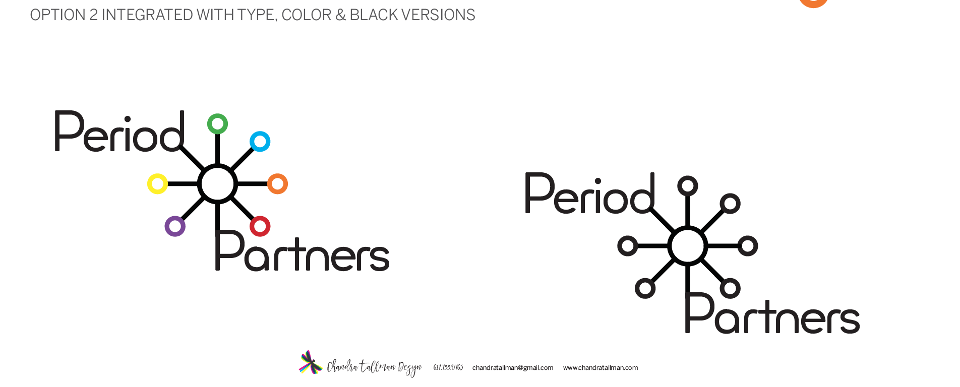
After we have the phone consultation, I send over an estimate and contract for the project. I like to draw, so I usually do several ideas with pen and paper before I sit down and start working on the computer. For the first round of ideas, I send options of wordmarks and logo designs in black. A logo needs to work black before you can even think about color options. What is a wordmark you ask? A wordmark or logotype is when only the letters of the name make up the logo. Round One also had different options on the typography used. At the bottom of this blog, you can see some options that were included in Round 1.
Step 4 Round 2 and 3
In Round Two, the ideas were refined into translated 2 options and showing color variations, how the logo would work on their stickers, and a business card. In Round Three, the client asked to see some more variations and refinement of the color option. This led to me showing some more variations on position of typography and the graphic symbol. After this version, the client made a decision. The final logo uses a geometric dot pattern and the typeface Minimo. This typeface had a modern feel and I loved the rounded shapes of the letterforms, also playing off the roundness of circles/the period. In the earlier rounds, the word Partners was set in cap P and lowercase for the rest of the name. The lowercase letter "t" in this particular font was one of the factors in choosing this typeface.
Final Delivery
For the final delivery stage, I put together color versions of the logo and a branding guide. The branding guide shows the usage rules of the logo, with and without the tagline, size do's and don'ts, and the color breakdown (CMYK, Pantone Colors). This guide is another essential component of logo design. For this project, I purchased the font Minimo, through Creative Market, a great resource. So I will be passing the baton over to the client now, to be in charge of keeping this logo in check.
If you would like a Brand Identity or logo designed and work with me, please contact me at chandratallman@gmail.com or call me at 617.733.0765. I'd love to work with you!