Custom Design: Icons! by Chandra Tallman

Here is a preview of a custom design content for a website soon to launch for Simplify Simplify. I created icons for  all the types of services this client provides her clients. 

Wouldn't these look amazing as stickers?! 

Custom Typography for Steps of Process for Site

CTDesignSS_WebNumbers_LIFE1234.png

Route 5 Boots & Shoes by Chandra Tallman

Gallery of some screenshots of the Route 5 Site click here to view live site.

The Route 5 Boots & Shoes site was created in January 2018 and was completed in early February. I help Route 5 with the site maintenance, their e-mail marketing campaigns for the mailing list subscribers, and creating campaigns for their special pre-order lines like Asphalt Work shoes. I created custom icons for the site, tombstone design of all the brands carried in the store, art directed all the images, created all the product listings, edited individual images for the product listings, compiled and edited all the text on the site. 

Route 5 is the site to find all your winter, work, duty boot and shoe needs!

E-mail Marketing Campaigns by Chandra Tallman

One of the services I have added to my list; is designing E-mail Marketing Campaigns on either Constant Contact or MailChimp. Two clients I help with this are Hat Stuff and Route 5 Boots & Shoes. 

Hat Stuff E-mail Campaigns

Hat Stuff sends out monthly campaigns on the Constant Contact platform to its e-mail list regarding new products, upcoming shows and info about their latest catalog. They already had been doing their campaign, but I helped redesign it to have a better look. I made adjustments to the images, created a new color palette for each campaign, and consistent typography throughout. 

Route 5 Boots & Shoes

Route 5 has a similar approach but we are also building awareness about the business and offering promotions in the e-mail campaigns. Their campaigns are created in MailChimp. 
We are compiling the list of subscribers from viewers of the website filling out the mailing list form. 

There so many benefits to e-mail marketing:

  • cost effective

  • increase brand awareness

  • sell products/services and increase sales

  • keep your customers updated on the latest news 

  • drive traffic to your website

Contact me today if you need a custom e-mail marketing campaign for your business!

Elite Stoneworks Branding & Website by Chandra Tallman

Elite Stoneworks Brand Identity & Website Creation

EliteStoneworksGray_3x3.png

Elite focuses on custom masonry in the greater Boston area creating patios, walkways, and outdoor living spaces. The owner of Elite came to me with a few design requests for his business.
1. Business Cards
2. Website Creation
3. T-shirt Design. 

Brand Identity: Some companies have a logo they like and want to keep. Elite had a logo, but I recreated a new logo to be used on all of their branding. With Elite I created the logo and different type choices for the name of the company. I gave the owner several options to choose from. From there I created business card options with double sided printing and images showcasing examples of their work.

Website: This business did not have a website, but it does have a Facebook business page and Home Advisor Listing. So I created a site from scratch. The purpose of the site is to showcase the beautiful masonry work and give customers a spot to request a quote. The work makes this site come alive. I compiled all the information and photos, wrote the copy and created his website. This site came together quickly due to quick turnaround of asset delivery and decision making from the owner. 

I have also assisted with creation of advertisements for Elite Stoneworks as well. 

Contact Andre for your next outdoor hardscape design, you will be amazed at their beautiful craftmanship!

Fa la la la la la la la la by Chandra Tallman

Happy Holidays! 

Christmastime is such a great time of year. I just wanted to share some sweet luxury farmhouse images by OntheMoon from Creative Market. You can see a few of them below in the slideshow. They utilize a neutral palette, a touch of holiday with some evergreen, and a whole lot of style. You can find them here if you would like to download yourself! 

If you love them, they are free this week only! 

Pristine Cleaning Brand Identity, Facebook Business, and Collateral by Chandra Tallman

Hello! One of my latest logos designs was for Pristine Cleaning of Southborough, MA. They specialize in non-toxic cleaning practices for your home or business, so we wanted to deliver this message visually with their logo. 

I helped PC create a new identity, business cards, Payment/Survey Envelope, T-shirt Designs, plus Facebook Business Page/Social Media Posts. It is really rewarding tocreate designs and make a difference in a business. 

Strong Brand Identity = Brand Impact in the Marketplace

Here are the working designs for the logo design. I tried some options with lavender, and also a bucket with the leaves, using green/nature and blue/water. 

ChandraTallmanDesign_PR_Page_3.jpg
ChandraTallmanDesign_PR_Page_5.jpg

Chosen Logo Design. The bucket with the leaves was the winner. The logo needs to have a few different versions:horizontal, vertical, black and white, color. Some translate well on no background, and others need to knock out so they stand out on a background. 

Payment/Survey Envelope. My client had the idea to have a survey envelope, to produce and their clients could also add their payment. This is a great touch to leave, and another signature piece for your brand. 

PC_EnvelopeVert_vista2.jpg

Facebook. I created the Facebook Business Page for the client and all Post Imagery check it out, click here. 
@pristinecleaningma

Latest Newsletter for Marlborough Regional Chamber of Commerce by Chandra Tallman

Case Study: MRCC Newsletter

The Marlborough area is really growing in the last few years and it seems to be the hot new place for businesses to gravitate towards. I can't believe I have lived in the area 15 years! So much change just in the last few! This Volume 2 newsletter is coming out in November 2017. It was a bit larger than the last few I have designed, coming out at 12 pages, when it is usually 8. The purpose of the newsletter is to showcase the benefits of MRCC membership benefits and to showcase new and renewing members, and event spotlights.

5 Types Of Logos Infographic By Creato by Chandra Tallman

This is a great infographic by Creato that displays the five types of logo design. Most clients I work with want a combination of a wordmark and graphic, ex. Red River CCFP, Ciao Bella Fitness, Period Partners. One of my favorite wordmark logos is the FedEx logo by Paul Rand. I love the use of negative space that creates the arrow in between the E and x. When I am working on a logo project, I approach my list of to-dos attempting to create examples of the brand in these types of logos during the design thinking process. Then I narrow down the ideas and present the strongest ones to the client.  

What type of logo do you currently have? Is it working for you? Contact me for a custom logo design for your brand! 

5-Types-Of-Logos-Creato.png

White Paper Design by Chandra Tallman

A great tool to present your companies message is through white paper features. Some clients print or keep these as digital files to send out to their audience. I create these for MIT Technology Review Custom. This particular white paper was very successful with the message: Finance and HR: The Cloud's New Power Partnership.

Beginning Stages. To kick off the design process, I am handed an edited copy of the text, charts & callouts to assemble a layout. I researched images for the opener and interior of this piece and provide several choices for the client. The white paper is similar to a magazine feature, it contains.  

Infographics. I am provided PowerPoint slides of the charts to recreate infographics. I create my infographics in Adobe Illustrator and InDesign. I usually end up having the whole infographic in InDesign, so that I'm not hopping back and forth between programs. Sometimes I do the initial drawing in Illustrator then bring in the details in InDesign. If you there is a lot of typography in your charts, etc, it is always easier to have it in InDesign. For consistency, I create styles they all work as a package with a color palette, bar size, line size, and typography. There can be a lot of back and forth with changes, especially in a piece like this, if information needs to added or deleted, charts need to be moved around for better positioning.

If you have any questions about the design or are interested in having white papers designed for your company, please contact me


Photos by © tai111 – stock.adobe.com


Brand Yourself by Chandra Tallman

Fall means back to school, new clothes and for me an updated website with recent work. I'm working on branding myself and increasing more traffic to my site and building my business clientele. Please let me know what you think of the way my website looks. I am using logos for each of my portfolio sections to be the slideshow when viewers land on my site, instead of the first sample of work being cropped/chopped off in the previous view.

Biggest Web Design for Me Yet by Chandra Tallman

Last month I started working on the redesign of www.sasshoesbuffalo.com. This is the first major Commerce site I worked on thru Squarespace, and my 4th site creation. SAS Shoes is a comfort shoe company for men and women, plus it is AMERICAN-MADE!!

What Did I Learn From this Site Design?

1. Patience for Product Listings. This took way more time than I envisioned it taking at the beginning. First, I didn't think I would have to create a separate listing for every shoe model and color. Plus, the numerous sizes/width combos available is a really long list! Squarespace has limits, so it wouldn't allow 1 listing for all the shoes because that is more variants than the code can handle. SAS is full of options. Some shoes have almost 100 variants available! They offer Slim, Narrow, Medium, Wide, Double Wide, and even Triple Wide in some models. Each shoe/color had to be a separate product listing. I cross-referenced with the corporate site to make sure I had the right sizing offerings. I started off creating a shop folder, with subcategories for Casual Shoes, Sandals, Dress, Active. In the end, the client need to have all the shoes together really needed to be met. For example, I merged Casual, Dress, Active, Slip-Resistant so that one can shop all of Women's shoes together, or click on those categories to filter the shoes. Since there are so many sandals, they are separate, with their own subcategories. Squarespace limits the number of products per shop page as well, so that is also a good reason for Sandals to be separate. I am really glad I did create it first with all the different shop pages, because it is easier when creating the listings to have them grouped that way. I made sure I used tags and category tagging so that when I merged, the shoes that are labeled "Active" all populate when the viewer clicks on "Active" to see those shoes. Time is spent uploading images to the listing, adding listing copy, and creating the price, size and width variants.  

2. Thumbnail Images can be your nemesis. Shoes images were shot on different angles or the image was too wide for the thumbnail frame, so I had to do quite a bit of troubleshooting (thank you patient Squarespace helpers) and Photoshop work to change the canvas and image size so that the image would fit in the thumbnail view. Luckily not every shoe had to be fixed, but there the majority did. This really was the frustrating part, because after spending so much time creating all these listings, the last thing I wanted was to have to go into Photoshop and change all the thumbnail images one by one to create more white space so that they didn't auto crop. Plus, it took a bit of time and the whole shoe needed to be seen in the thumbnail view in order for the online shop to get approved. Once this back and forth of  fidgeting with the canvas/image size, reloading the site view, I got the images to view properly. It took a bit of maneuvering to get the right width and height to fit the frame. Delight is a wedge, so that had to have even more white space, in order to fit as well. 

3. I learned a lot about SAS Shoes. If you are on your feet all day or have problem feet, you need to go try on a pair of SAS Shoes. Your feet are worth it! Go visit my brother's store in Williamsville, NY or shop online! He and his knowledgeable staff can help you out. Now that I am well-versed commerce site design, if you are looking to create one for your business, check out SAS Shoes Buffalo, and contact me so we can set it up! 

Internet Site Designs vs. Chandra Tallman Design by Chandra Tallman

Five Reasons I'm better than Fiverr or other sites like that.
Keeping this short and sweet

1. I create custom designs for you. I'm not cookie cutter. Check out the examples of my work here

2. I have two decades of experience in the branding, magazine/editorial world, and training in Graphic Design from Simmons College. I love pouring over Brand Style Guides and being the "Logo Police" on a brand. 

3. I'm passionate about what I do, and give 110% to do the best design job for you. I am a sucker for great typography, super neat details on styling, and I'm not a fan of colons. There are type styles to avoid colons. 

4. I'm a multi-tasker... a mom... I can juggle a lot and don't like to waste MY TIME or YOURS. 

5. Service with a Smile. I won't stop coming up with ideas, until you are satisfied! Read some of my testimonials. Life is too short to not smile, people!!  

Chandra Tallman Design Facebook Post 

Chandra Tallman Design Facebook Post 

In a World of Blue by Chandra Tallman

Image credit: The Logo Company

Image credit: The Logo Company

Do you ever have a hard time making the distinction between one thing among many? Do you ever try to read something in digital or print and you don't know where to look first? Do you ever look at your phone and can't find an app amongst all the blue apps? I like to go against the grain and stand out among all the blue. Or turn things on their side, or upside down for a different way at looking at things. I might take a different approach to the design of the color emotion guide above. But isn't it interesting to see the words that are associated with specific colors and then see the logos that match that color path? Blue = Trust & Dependability could mean Oral-B, or Youthful and Exciting Red = Virgin. Some logos live out of the spectrum but contain many colors, for example: Google, NBC, and eBay. When designing a logo, I ask my clients several key questions. This is valuable information that helps me put together a strong brand but also paints a clearer picture of the brand itself. Answering those questions also can help the us focus on what the brand identity should and shouldn't be.

I can help your brand stand out against the blue. Contact me for a free 15 minute consultation. 


Case Study: Real Estate Flyers by Chandra Tallman

Client: Nina Sable, Century 21 Commonwealth in Natick MA  Sell With Sable!

Step 1: Meet with the Client. Nina and I discussed what she was looking for/flyer designs, who the end user was, where the flyers would be distributed. Nina is a SRES or Seniors Real Estate Specialist. She focuses on 50+ age group to make the shift from their current living situation to their next phase that includes tons of options. She helps them navigate thru the choices and transition each step of the way. Nina would like to have her end file template be a Word Document she can edit. 

My background is designing custom design work in Adobe Software programs, not Word. So I am also researching how I can design this quickly and easily in my comfort zone and then translate it for the client during this process.

Step 2: Nina sends me the Flyer Content she would like to use on different options, plus other assets/branding for Century 21. She gives me four typefaces they use, but in the end I use one for all the typography. I put together a round of a few ideas. During this process, I experiment in Microsoft Word. Nope. Can't do it. I am not designing this in Word. Adobe Indesign all the way... this is where I produce my ideas the best. I can save it as a PDF file then Export the PDF to a Microsoft Word Document. Bingo! We can make this work for the client!!

Step 3: Nina lets me know which direction she prefers and I keep rolling and produce 5 different Flyer options for her real estate clients. I play with the placement of the text and choose a modular design with color blocks of imagery and type. I give her options on the Arial typography: some headlines using all caps, some not. One template has the detailed paragraphs with and without a color background. I include a handful of stock art images for her to use that fits the 50+ clientele. 

Step 4: It's a Wrap! Final Delivery of Word Templates, PDF version just in case client would want to edit in Adobe Acrobat. I also include a Links file of Adobe Stock image that I chose for Nina to use in these Flyers. See Slideshow below of final Flyer Designs. All photos by Adobe Stock. If you know anyone who Nina could help find their next home, contact her today! 

Slideshow of Final Flyer Designs for Nina Sable

Case Study: Cloixonne Compensation Plan/Infographics Up Close by Chandra Tallman

Case Study: CloiXonné™ Compensation Plan 

Page 2 of Compensation Plan Design

Page 2 of Compensation Plan Design


Client: CloiXonné™ is a Multi-level Marketing Brand that is launching - brand new -in April 2017. They sell health supplements for people and pets. I was hired to create their compensation plan, but use existing brand elements already established. The givens: CloiXonné™ logo, fonts, line imagery graphic element. I was handed a word document with text and charts as the map for its structure and contents. My role was to design a comp plan that fit their brand, choose imagery to accompany the sections, and design the infographics (charts).  

Step 1 The client provided numerous examples of what existing materials look as research in understanding the background and what they were looking for. I review all this information and compare. This is helpful because you learn likes and dislikes of the client. It is easier to visualize and discuss.

CSCloixonneCTD.jpg

Step 2 I create the first design round for the client. This plan starts out as 10 pages, and during the process, other elements are added and deleted. I choose images that I feel evoke the feeling and style of the CloiXonné™ brand. Looking at existing colors and labeling of products, I create a plan that continues these elements. I use typographic cues, like color, size and weight change to change levels of importance and give the layout a structure. Infographics are always a favorite of mine to work on in the design process. I love taking a plain word document chart or table and putting some design magic on it. You can see a before and after here. You can see more examples of more infographics I have designed here.

Step 3 Any product of this size goes thru numerous rounds of edits, back and forth with the client, and showing to key stakeholders for changes and approval. I provide pdf files for review. New pages are added, so more documents are sent to me for these pages to be added. 

Final Product The final product is 12 pages long. This will live on their website and be available as a digital download for Ambassadors to print or save to read. I send over the final files to the client to add to their site. 

If you have any questions or would like to have a consultation regarding a report or infographics you would like custom designed for your company, please contact me. I have helped clients with small projects, for example, resaving a chart in different format, or redesigning to fit their presentation. I have experience in maps, complex statistics, and vision statements of figures. I can make your chart go from BLAH to AMAZING!  

A few of the infographics pages in the final compensation plan design

A few of the infographics pages in the final compensation plan design

Logo Design: Period Partners by Chandra Tallman

CTDesign 2017-03-25 at 5.34.16 PM.png

Case Study: Period Partners - Together for Menstrual Health

Client: Period Partners is a non-profit that is giving menstrual products to those in need on the North Shore area outside of Boston.

Step 1
To kick off this logo project, I sent the client a list of questions to answer and send back before we had a phone consultation. These questions range from company-related to project related questions. This information is essential in the process of design. 

Step 2 Phone Consultation
In this particular conversation, the client didn't want the logo to be too feminine. They wanted to show working together/partnership, accessibility, an engaging look, and inclusivity to all who menstruate. They wanted a logo that was "fresh, dynamic."  

Step 3 Ideas & Round 1 to Client
After we have the phone consultation, I send over an estimate and contract for the project. I like to draw, so I usually do several ideas with pen and paper before I sit down and start working on the computer. For the first round of ideas, I send options of wordmarks and logo designs in black. A logo needs to work black before you can even think about color options. What is a wordmark you ask? A wordmark or logotype is when only the letters of the name make up the logo. Round One also had different options on the typography used. At the bottom of this blog, you can see some options that were included in Round 1.

Step 4 Round 2 and 3
In Round Two, the ideas were refined into translated 2 options and showing color variations, how the logo would work on their stickers, and a business card. In Round Three, the client asked to see some more variations and refinement of the color option. This led to me showing some more variations on position of typography and the graphic symbol. After this version, the client made a decision. The final logo uses a geometric dot pattern and the typeface Minimo. This typeface had a modern feel and I loved the rounded shapes of the letterforms, also playing off the roundness of circles/the period. In the earlier rounds, the word Partners was set in cap P and lowercase for the rest of the name. The lowercase letter "t" in this particular font was one of the factors in choosing this typeface. 

Final Delivery
For the final delivery stage, I put together color versions of the logo and a branding guide. The branding guide shows the usage rules of the logo, with and without the tagline, size do's and don'ts, and the color breakdown (CMYK, Pantone Colors). This guide is another essential component of logo design. For this project, I purchased the font Minimo, through Creative Market, a great resource. So I will be passing the baton over to the client now, to be in charge of keeping this logo in check. 

If you would like a Brand Identity or logo designed and work with me, please contact me at chandratallman@gmail.com or call me at 617.733.0765. I'd love to work with you!

21761871_10155450871948145_6305178295532600353_n.jpg

Sticker Design in use! 

Brand Identity & Web Design: Red River CCFP by Chandra Tallman

I love working on Brand Identity Projects. Sketching out ideas by hand, then going to work digitally to create the next step on my computer is fun work for me. Plus, helping people make their business look pulled together with new brand identity is a game changer for the client! I enjoy making their logo dreams come true. It can also be thought of as problem solving. Problem: Logo/Identity Design. Solution: Research + Consultation +Sketching leads you to the process of creating the new brand. 

Case Study: Brand Identity and Web Design Project for Red River Child Care Food Program out of Texas.

Client Background 
Red River assists child care centers and home day care centers with putting nutritious foods on the plates of the children. They also help with many other important aspects like meal planning, center topics of concern, and training too.

Design Thinking So thinking on the lines of nutritious food and love because we want our kids to be well fed and loved when they are cared for away from home, led me to this creation. Those ideas together generated a heart with the leaves sprouting out of it. I wanted this to be happy and fun, and chose bright colors for the brand palette. 
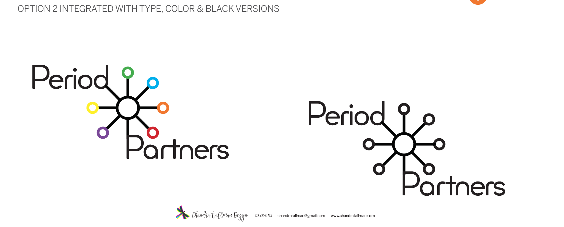
Step 1
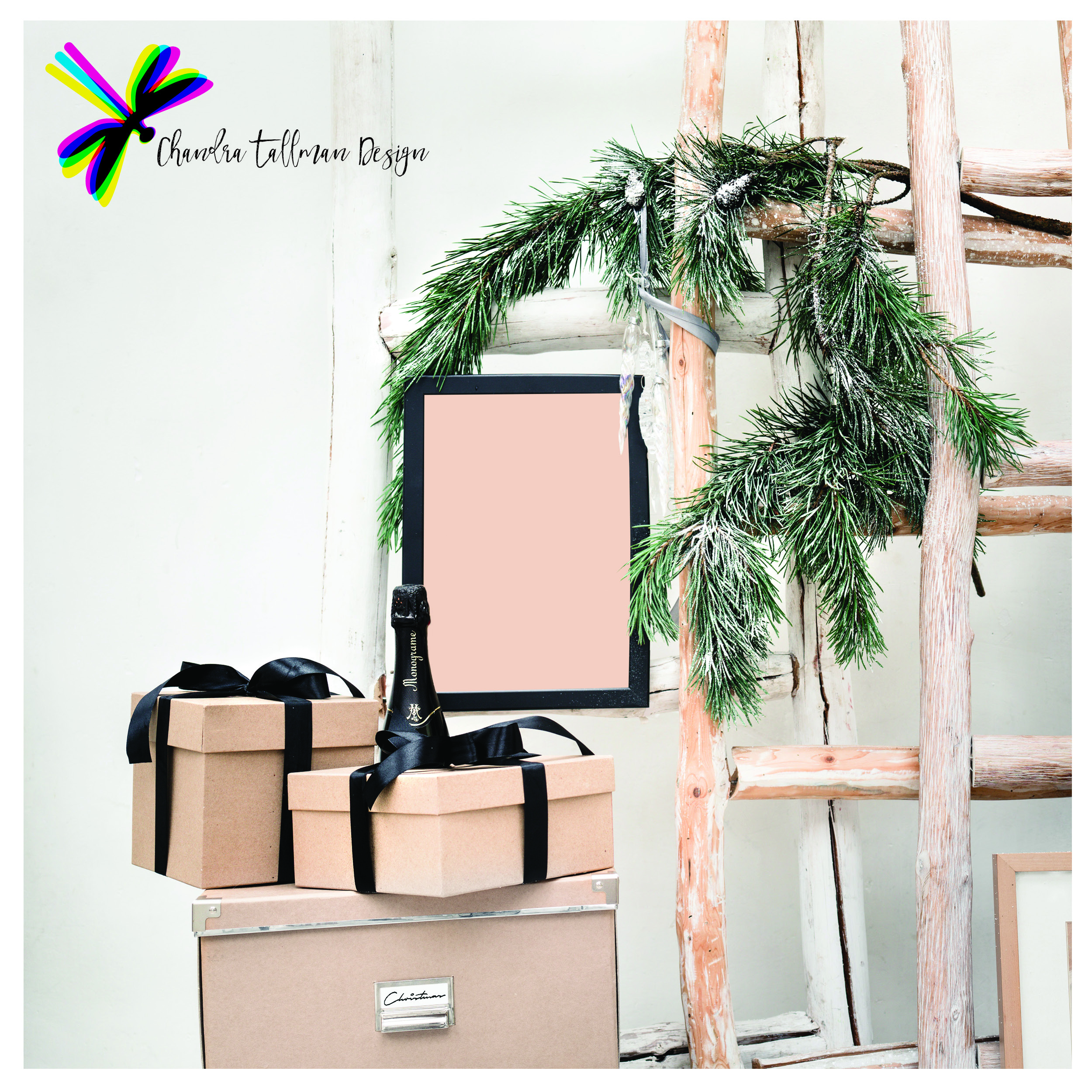
I put together a mood board of photos and illustrations as part of my research for Red River's new identity. Next, I sketched logo ideas on paper before I sat down to work digitally. I put together some options and when I showed the client, the heart and leaves was immediately chosen. "Stop, that's it!" the client said.

Step 2 Refinement & Design Pieces
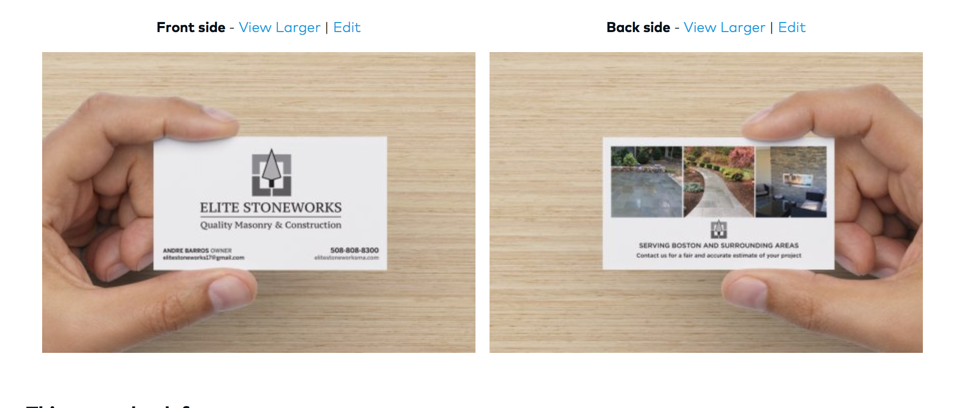
I swapped some typeface choices and we were there pretty quickly with this final logo design you see above. From there, I designed a business card and a magnet for the client. We are also planing on producing a trade show banner in the next month. 

Step 3 www.redriverccfp.org
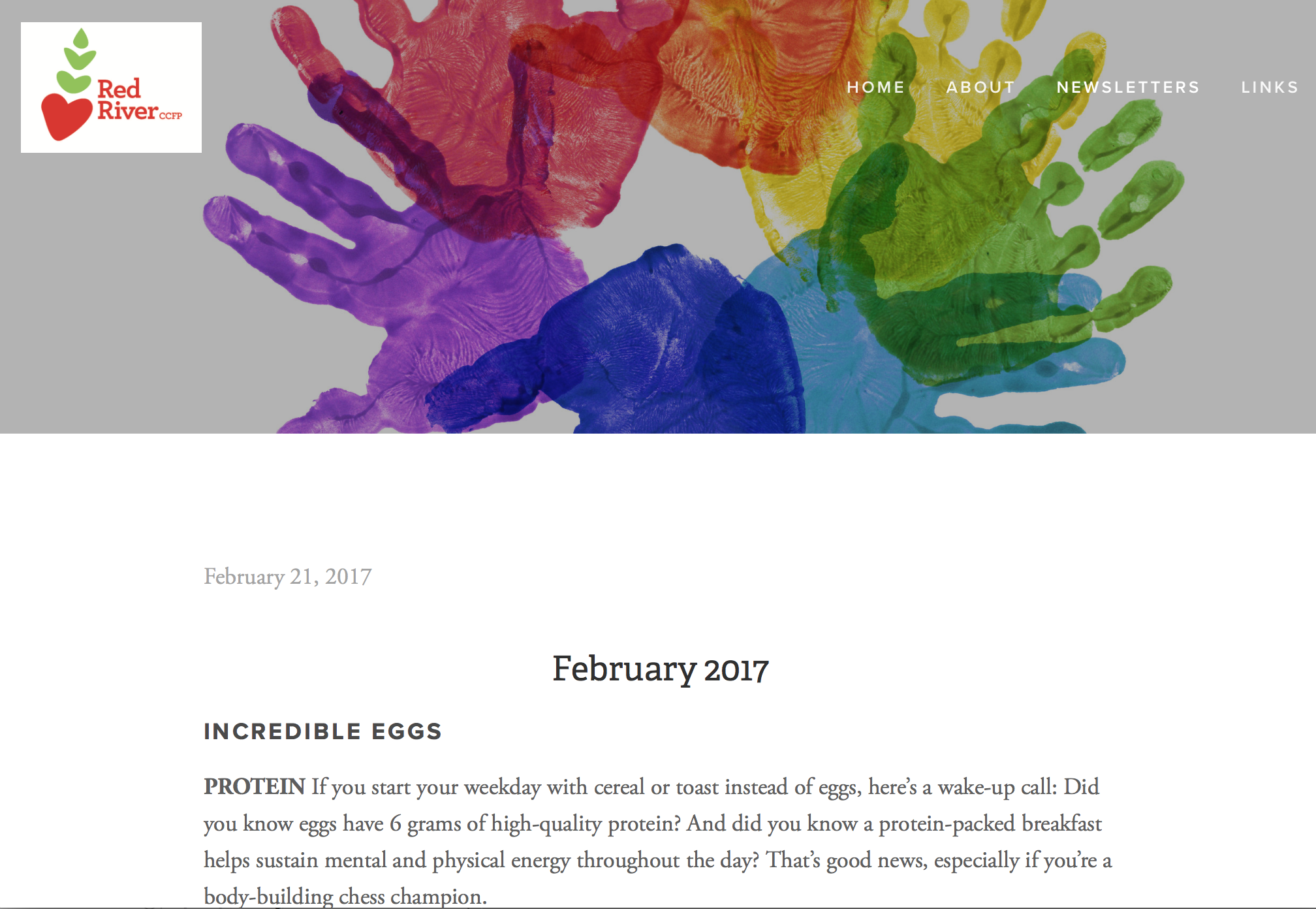
I created the website for Red River after discussing with the client their needs and preferences. They gave me an outline of the types of pages they wanted, its content, and links to competitors for comparison. I chose all the imagery, and wanted to use bold photography to set Red River apart from it's competitors. The majority of the images choices I made for the website came from the mood board I created when I first started the project (back in Step 1). I provided custom design work for the rate sheet, another way to keep the brand together, instead of using plain list of text. In addition, I am also maintaining the site, uploading newsletters each month, plus designing some marketing materials for events. Please check out www.redriverccfp.org and all that it has to offer! 

DO YOU NEED A NEW BRAND IDENTITY?
If you would like to have your brand identity updated, this is a list of what to expect in the process (web design, monthly web maintenance, and other marketing materials is an extra fee): 

THIS PACKAGE INCLUDES

  • Brand Discovery Meeting In this meeting we’ll dig deep into what the core of your brand is. This will help inform the brand identity.
  • Brand Strategy + Moodboard After our brand discovery meeting I’ll gather all the information we discussed and compile it into a brand strategy and mood board which will help establish the visual look and ensure that we are on the same page. 
  • Visual Brand Identity logo, color palette, typography, secondary elements such as patterns or illustrations.
  • Brand Guidelines to help you maintain and be in charge of your brand.

Ready to take your business to the next level? Contact me at chandratallman@gmail.com to set up a half hour information call. I’ll get to know all about your business and you’ll get to know about my process! We can discuss pricing, and I will send you a job estimate with a timeline of milestones. Reserve your spot in my design schedule with a 50% deposit and signed contract. 

If you would like a Brand Identity or logo designed and work with me on other types of design, please contact me at chandratallman@gmail.com or call me at 617.733.0765. I'd love to work with you!

CTDESIGN_REDRIVERCCFP